
What Font Should I Choose for Engraving? A Real Guide to Babe's Hardware Fonts
This is the question we get more than almost any other. You've picked what you want engraved. You know the piece. And then you hit the font options and realize you have no frame of reference for what "2BH" actually looks like on metal.
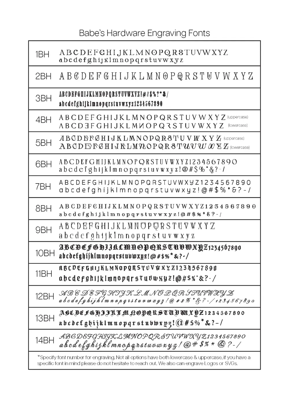
So here it is — every font we offer, what it actually looks like, what it's good for, and which pieces it works best on. Bookmark this before you order.
The full font & graphic chart is also available on our fonts page →
First: How to Think About Engraving Fonts
Metal engraving isn't the same as printing on paper. A few things to know before you choose:
Thin lines disappear. Very delicate, hairline fonts can lose detail when engraved on metal — especially on mirror finishes. Fonts with some weight to them hold up better.
Short words can go bigger. Long phrases need to go smaller. We'll size your engraving to fit the space. If you have a long phrase, a simpler font reads better than an ornate one at small sizes.
Gold vs. silver finish changes how fonts look. Script fonts feel warm and personal on the gold chrome. Block or gothic fonts hit harder on the cool silver. Neither is a rule — just something to keep in mind.
The Fonts, Broken Down
Script & Cursive Fonts
Best for: names, words, phrases with a personal, emotional, or spiritual tone
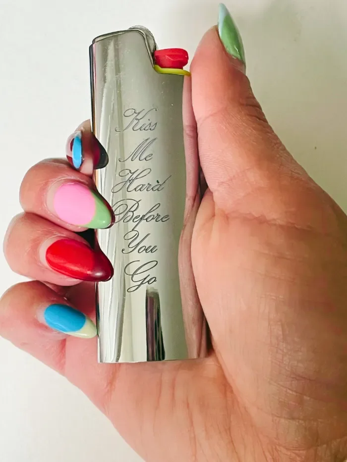
12BH — Flowing Elegant Script This is your classic, sweeping cursive. Uppercase letters have long, looping entries. It's the font for "Immaculate Heart," for a grandmother's name, for a wedding gift that needs to feel like an heirloom. Works beautifully on gold. If you want something that reads as deeply personal, this is it.
Good for: names, spiritual phrases, anniversary gifts, anything you'd describe as "romantic" or "sacred"14BH — Italic Script Slightly more upright and refined than 12BH, with a calligraphy quality that feels intentional without being overdone. "Blessed" lives in this territory — elegant but with a little edge. Great for single words where you want the letterforms to do the work.
Good for: single words, initials, shorter phrases, gifts for someone with taste
13BH — Ornate Gothic Script Where script meets blackletter. The letters have the flow of cursive but the weight and drama of gothic type. This one turns heads. If you want something that feels like it was pulled from a 16th century manuscript or a tattoo flash sheet at a shop in East LA, this is your font.
Good for: names you want to hit hard, spiritual words, anything you'd also consider getting tattooed
Gothic & Blackletter Fonts
Best for: last names, bold single words, pieces that should feel strong rather than delicate
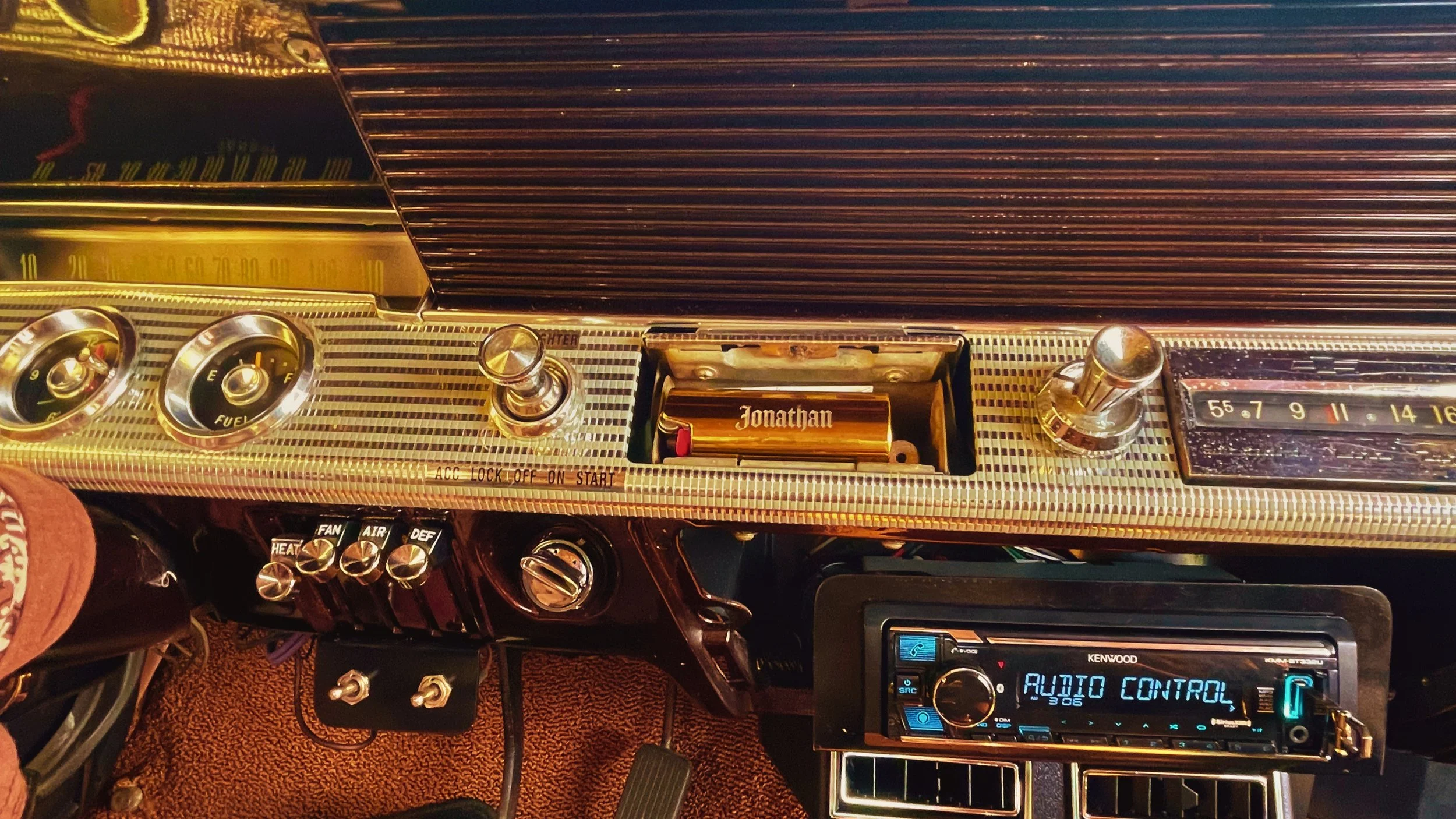
10BH — Classic Old English The standard blackletter. This is "Jonathan" — a name that, in this font, looks like it belongs on the back of a letterman jacket or carved into a church pew. Full uppercase and lowercase, numbers included. The most versatile gothic option we carry.
Good for: last names, first names, any word you want to feel weighty and permanent
13BH — Heavy Ornate Blackletter More decoration on the letters than 7BH. More flourishes, more presence, more drama. If 7BH is gothic, 10BH is gothic with a crown on. Works best on shorter text — a single name or word — where the detail in each letter has room to show.
Good for: one-word engravings, names with 4–8 characters, pieces you want to feel almost medieval in the best possible way
11BH — Mixed Weight Blackletter Sits between 7BH and 10BH in terms of weight. A slightly more condensed letterform that works well if you have a longer name or phrase but still want the gothic aesthetic.
Good for: longer names, phrases in gothic style, when 10BH feels like too much
Serif Fonts
Best for: initials, clean minimalist looks, names where you want elegance over edge
1BH — Classic Serif Your traditional serif — think something between a book font and a newspaper masthead. Upper and lowercase. Clean, readable, timeless. This is "LV" on silver — two letters that look like they cost four figures because the font is doing exactly what it should: staying out of the way and letting the piece speak.
Good for: initials, short names, anyone who wants understated over dramatic
6BH — Refined Serif A lighter, slightly more elegant take on the serif. The letterforms have a little more breathing room. If 1BH is a serif suit, 6BH is a serif linen shirt. Works beautifully on gold where you want warmth without sentimentality.
Good for: initials, short names, gifts for someone with a clean, minimal aesthetic
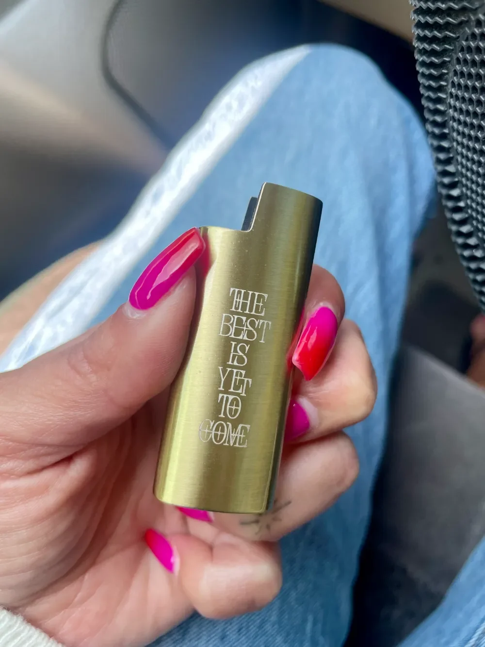
Decorative & Display Fonts
Best for: when you want something that looks different from anything else
4BH — Geometric Display Structured and angular. The uppercase and lowercase versions have noticeably different character — the lowercase is almost architectural. Not for everything, but for the right piece it's unlike anything else in the lineup.
Good for: design-forward pieces, when you want a font that looks custom
2BH — Ornate Display Decorative to the point of being almost illustrative. This font has personality — a lot of it. Best used sparingly: one word, or initials, where the letterforms themselves are the design.
Good for: single words or letters where you want maximum visual impact
6BH and 8BH — Structured Serif Variants Both are clean, serif-adjacent options with full character sets including numbers and symbols. 6BH has slightly more traditional proportions; 8BH is more condensed. If you need numbers alongside letters — a date, a jersey number, a year — these hold both well.
Good for: dates, numbers + letters combinations, clean engraving with full character support
Quick Reference: Font by Vibe
| If you want... | Try this font |
|---|---|
| Something that feels like a tattoo | 7BH, 10BH, or 13BH |
| Clean and expensive-looking | 1BH or 9BH |
| Personal and romantic | 12BH or 14BH |
| Bold and direct | 3BH or 7BH |
| Delicate and spiritual | 12BH |
| Initials only | 2BH or 1BH |
| Something nobody else has | 5BH or 4BH |
| Dark gothic vibe | 10BH |
How to Tell Us Your Font Choice
When you add your order to cart, put your engraving info in the personalization box like this:
Text: Blessed
Select Font in Dropdown: 14BH
If you're not sure, tell us what you're going for — the vibe, the aesthetic, who it's for — and we'll recommend the right one. We'd rather spend two minutes helping you get it right than have you receive something that's close but not quite.